Setting uniform rounded corners on a view in Swift is a relatively trivial task by setting the cornerRadius property on the view's layer. But what if not all of the corners need to be rounded? Or different radii are needed for each corner? This post goes over several different methods to approach these issues in Swift and SwiftUI.
Swift Examples
Example 1
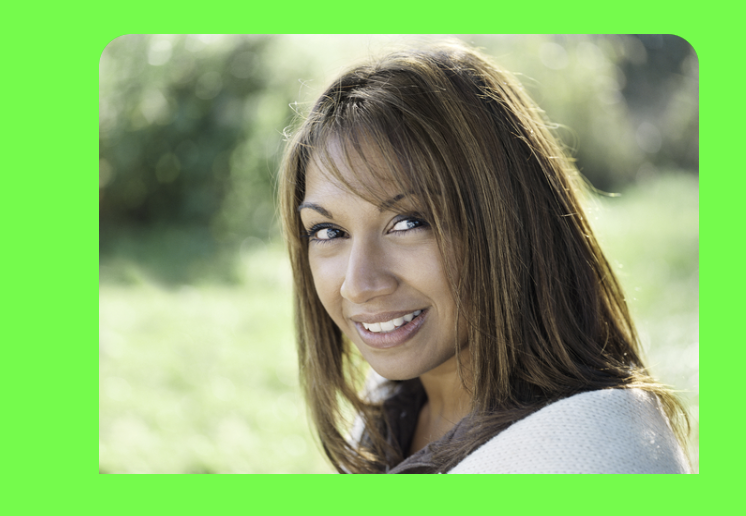
This first example shows how to set the top two corners of the image to have a corner radius of 16 by setting the layer's maskedCorners property.
let cornerRadius:CGFloat = 16.0
stockImageView.layer.cornerRadius = cornerRadius
stockImageView.clipsToBounds = true
stockImageView.layer.maskedCorners = [.layerMinXMinYCorner, .layerMaxXMinYCorner]
Example 2
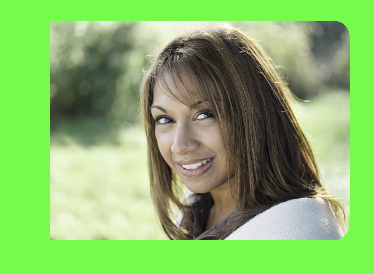
This next example makes use of a a UIBezierPath and a masking layer to round off the two corners on the right. It's not as straightforward as the previous example, but its approach will prove useful for the next example.
let pathWithRadius = UIBezierPath(roundedRect: stockImageView.bounds, byRoundingCorners: [.topRight, .bottomRight], cornerRadii: CGSizeMake(16.0, 16.0))
let maskLayer = CAShapeLayer()
maskLayer.path = pathWithRadius.cgPath
stockImageView.layer.mask = maskLayer
Example 3
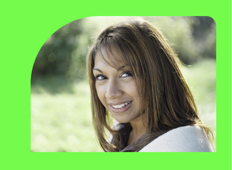
This is the most complex example, but the most flexible. As demonstrated in Example 2, a UIBezierPath and CAShapeLayer are used to create a mask to create an image with custom rounded corners. Whereas Example 2 used a rounded rectangle to predefine the shape of the path, this example creates its own shape using a combination of lines and arcs, which results in a rectangular-like shape with different sized rounded top corners. This example can be extended with a variety of shapes, such as a star.
let imageHeight = stockImageView.bounds.height
let imageWidth = stockImageView.bounds.width
let topLeftRadius = imageHeight / 2.0
let topRightRadius = 16.0
let customBezierMask = UIBezierPath()

// Starting point
customBezierMask.move(to: CGPoint(x: topLeftRadius, y: 0.0))
// Top line
customBezierMask.addLine(to: CGPoint(x: imageWidth-topRightRadius, y: 0.0))
// Top right corner with a radius of 16.0
customBezierMask.addArc(withCenter: CGPoint(x: imageWidth-topRightRadius, y: topRightRadius), radius: topRightRadius, startAngle: 3 * .pi/2, endAngle: 0, clockwise: true)
// Right line
customBezierMask.addLine(to: CGPoint(x: imageWidth, y: imageHeight))
// Bottom line
customBezierMask.addLine(to: CGPoint(x: 0.0, y: imageHeight))
// Left line
customBezierMask.addLine(to: CGPoint(x: 0.0, y: imageHeight - topLeftRadius))
// Top left corner with a radius that is half the height of the image
customBezierMask.addArc(withCenter: CGPoint(x: topLeftRadius, y: imageHeight - topLeftRadius), radius: topLeftRadius, startAngle: .pi, endAngle: 3 * .pi/2, clockwise: true)

let maskLayer = CAShapeLayer()
maskLayer.path = customBezierMask.cgPath
stockImageView.layer.mask = maskLayer
SwiftUI Examples
Example 1
This first SwiftUI example is modeled after Example 3 with the different rounded corners. Some of the principles are similar by using a custom Path, but there are also notable differences in the implementations between Swift and SwiftUI.
- Instead of applying a
UIBezierPathto aCAShapeLayer, a struct which adheres to theShapeprotocol is used, and thePathis defined inside the struct. UIBezierPathuses theaddArc()method to define how to draw the rounded corners,Pathuses the slightly different methodaddRelativeArc(), which seems a little more straightforward (and it can acceptAnglevalues which can be defined using either degrees or radians).- In SwiftUI,
ImagecallsclipShape()on aShapestruct. There is also amask()method which can be used in some cases, butclipShape()is better for this example. The previous Swift example applies a mask layer.
Example 2
An even easier approach for this particular technique with different rounded corners is to use the .clipShape() method with a .rect that has custom radii via the RectangleCornerRadii struct. This is a far simpler method to produce the same results.
let rectCornerRadii = RectangleCornerRadii(topLeading:119, bottomLeading: 0, bottomTrailing: 0, topTrailing: 16)

Image("BRF002-small")
	.resizable()
	.scaledToFill()
	.frame(width: 320, height: 238)
	.clipShape(.rect(cornerRadii: rectCornerRadii))
Using a custom path can be useful for creating unique shapes (such as a star), but for this demonstration which focused on providing rounded corners to an image, there are alternate solutions which don't require nearly as much code. In particular, this final SwiftUI example leverages the power of new functionality provided in this newer UI framework.
References
- CustomRoundedCorners — Swift Playground project
- CustomRoundedImageView.swift — GitHub Gist of the SwiftUI example